ASW Reimagined
Art Supply Warehouse, my current workplace’s website, is a mom & pop art supply retailer. I breathed new life into the current website’s homepage, product page, and gallery page, in both desktop and mobile versions.

Problem
Art Supply Warehouse’s old UI suffered from a myriad of issues:
convoluted information architecture
outdated user interface
information overload
Role
Research, Design Direction, Prototyping
Research
Who were the users?
ASW customers
ASW employees
What kind of research was conducted?
Secondary/competitor research. Compiling a list of other e-commerce businesses was just the beginning of a UI/UX rehaul. After making note of UI trends such as: product listing formats, navigation standards, and functional animations.
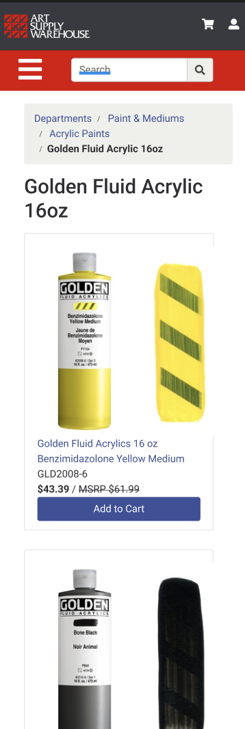
ASW’s Original UI
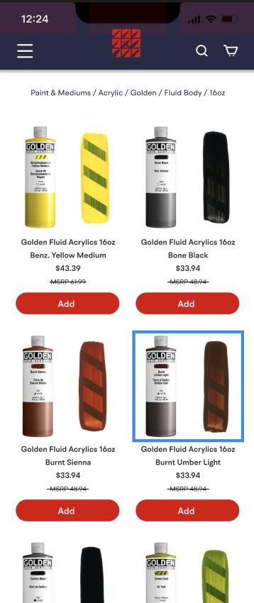
Color- ASW’s old UI utilizes mostly dark gray and their signature red, with white accents. In order to freshen up their aesthetic, a more saturated color needed to take center stage in place of the grey. The navy blue exudes reliability, professionalism and easygoingness.

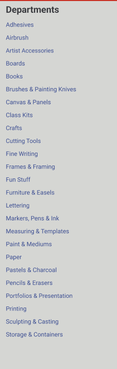
Navigation- ASW’s old navigation is convoluted because of a lack of care put into organizing each category. This paired with the perpendicular Departments menu and the red navigation bar result in a crossroad where users are forced to subconsciously reconfigure their thoughts
Solution- by collapsing the previous Departments menu into the original header, the website benefits from a more minimal and straightforward interface.
Revised Information Architecture

Old


Mobile Website Product Pages


Mobile Website Gallery Pages
New
Conclusion
ASW’s old website suffered from cognitive overload, drab aesthetics, and confusing navigation. By eliminating visual clutter, revamping the color palette and restructuring the information architecture, I’m confident in ASW’s improvement in customer retention and overall usability.